Colormaps and Colorbars
Every now and then, the geophysics community debates furiously about which colormap is best to display geophysical data. This is not a new issue and the starting point for this discussion seems to be roughly 1996 when Rogowitz and Treinish started to question the use of rainbow-like colormaps for scientific visualisation.
Despite its obvious flaws, the rainbow (or “jet”) colormap is still used a lot, especially in geosciences. Rainbow-slayers regularly try to kill the beast, but it keeps coming back! A major blow in the rainbow came two years ago with the adoption by both MATLAB and matplotlib of new default colormaps. The latest attempt comes from Matt Hall in a well-argued post.
The reasons for the love
Why do some geophysicists still like rainbow-like colormaps? I am not going to list all the reasons why old habits are still persistent (it’s probably because they are old habits…), but I would like to make the case for one particular use that is more relevant to my experience: potential fields data. The interpretation of this sort of data is all about describing anomalies: they can be negative and positive, big and small; and then there are extreme anomalies… Ideally we would like to visualise all these different types of anomalies at the same time, in a single map. That can become quickly impossible with perceptually uniform colormaps.
Here is an example with some magnetic data from an airborne survey that was completed for the USGS over an area in Colorado (Bankey and Grauch, 2004). The acquisition report and the data can be downloaded from this page. In the following plots, I am using the gridded Reduced-To-Pole magnetic anomalies derived by the USGS from the measurements. Also, all the maps in this post have been produced with interpies, a Python package that I have created to help geophysicist (and me!) to process and display their data.
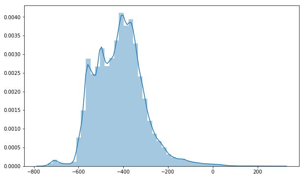
Before making a map of the grid, it’s a good idea to look at the distribution of anomalies (Figure 1). The distribution is quite uneven, with the bulk of the values situated between -600 and -200 nT. The histogram is skewed towards the right and there is a long tail of positive anomalies up to +300 nT.
Now, following advocates of perceptually uniform colormaps, here is a map of the anomalies using viridis, the default colormap in matplotlib (Figure 2).
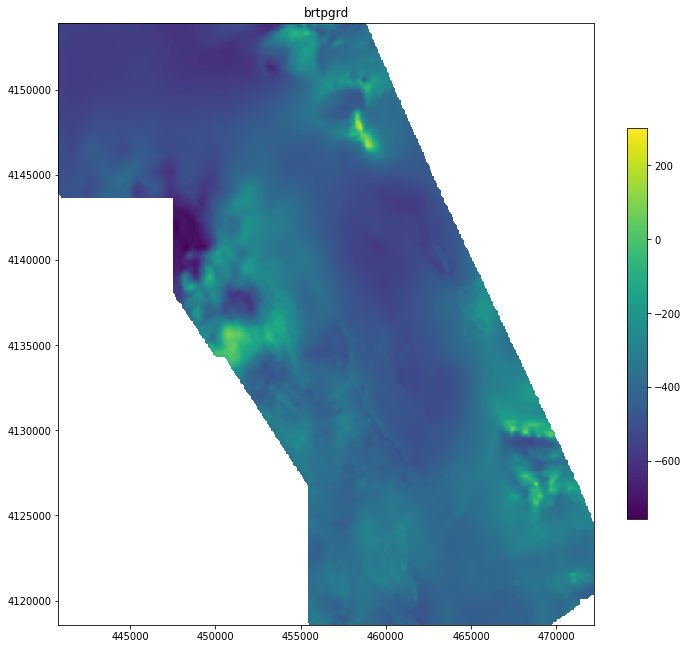
So yes, the linear increase in brightness of viridis provides a coherent representation of the distribution we saw earlier. Most of the anomalies are in the blue-greenish zone around the mean at -418. Bright yellow spots indicate the highs and how localised they are.
We create maps for a purpose. So if the purpose is to locate only the highest anomalies, then this map is suitable. However, most interpreters would like to go further.
Diverging colormaps for anomalies
Anomalies on either sides of a central “mean” are ideally mapped with diverging colormaps. And rainbow is essentially a diverging colormap: the central green-yellow is the brightest colour, and the blue and red ends are mapping minimum and maximum values, i.e. negative and positive anomalies. The standard “geosoft” colormap is widely used in the grav-mag community. Let’s see how it performs with these data (Figure 3).
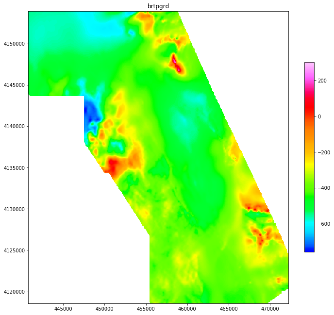
The result is not great, certainly not superior to the previous example. So maybe changing the colormap was not the best option to obtain a good visualisation.
Dealing with uneven distributions
Magnetic properties of rocks can vary greatly so it is not surprising to see such extreme distributions. The common approach is therefore to “re-balance” the distribution to minimise the importance of the extremes. Graphically, this can be done by histogram equalisation.
Traditionally, this normalisation would be applied to the data. In interpies, I have experimented a different approach: instead of modifying the data, the colormap is modified to visually achieve the same result (Figure 4).
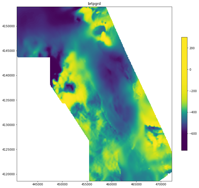
The result is that more details are now visible in the areas away from the big positive anomalies. The important part in this map is the colorbar: it clearly indicates both the range of values (as before) but also the data distribution. A large range of anomalies are shown with the same yellow but that is the price to pay to see the other anomalies. Moreover, this manipulation is not hidden, contrary to the case where the data range is simply clipped.
Hillshading
More options are available to create good maps. Inevitably, with or without equalisation, portions of the map will show uniform colours, despite the presence of small variations. Adding hillshade is generally the best way to highlight details and structures in those areas (Figure 5).
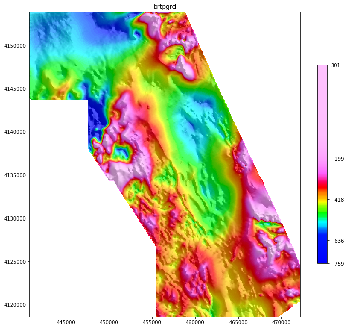
I think this map is a good example where the geosoft colormap shows its interest: it has a bright pink top end that, when associated with histogram equalisation, takes on all the extreme positive anomalies, leaving the “normal” rainbow from blue to red to represent the bulk of the data. The colormap and the equalisation therefore work together to create the impression of uniform data distribution.
Use the colorbar
Nobody should be fooled by the visualisation tricks used to make the previous map. The colorbar is there to indicate the real distribution of the anomalies. I have also added an option in interpies that allows you to put the mean and the standard deviation as a scale that should be more meaningful than linearly spaced ticks (Figure 5).
Conclusion
Manipulating the data or the colormap should not be a problem if the method and the intention are clearly described with the map. Why not making several maps? Reports are electronic, articles can have appendices. That does not cost anything. A first map with a perceptual colormap and no normalisation can give a sense of scale. A second map like the one in figure 5 can be used for qualitative interpretation and to differentiate anomalies.
A colormap should be selected with care, but it depends on the data. Some colormaps distort the perception in order to highlight certain features. But filters and transformations have the same purpose: their application is used to extract information from the data and to eventually tell a story. Careful though: applying both non-perceptual colormaps and filters should be avoided because this might create some confusion if they do not work together.
More examples
I have created a Jupyter notebook that presents most of the options available in interpies to make maps. The module is based on matplotlib and allows you to create complex displays with just one function and its parameters.
Reference
Bankey, V., Grauch, V.J.S., 2004. Digital aeromagnetic data and derivative products from a helicopter survey over the town of Blanca and surrounding areas, Alamosa and Costilla counties, Colorado, Open-File Report.
Kovesi, P., 2015. Good Colour Maps: How to Design Them. arXiv:1509.03700 [cs.GR] 2015