Hillshading with matplotlib
Summary
Hillshading simulates the variable illumination of a surface by a directional light source. It is a great method to represent relief on a map and it works very well with potential field data too, not only with topographic data. Creating shaded maps in Python with matplotlib is easy and a few examples are provided here. However, a simple transparency blend of the hillshade with the coloured data seems to be missing. So I have added this option to a modified version of imshow.
Introduction
Shaded relief has been used to represent topography on maps for centuries. Adding a sense of visual relief by drawing shades according to the direction of the sun is an art when it is done manually like cartographers used to do before the advances of mapping software. Today, hillshading is mostly generated analytically from digital elevation models. Even so, professionals still consider that the best results are obtained when manual adjustments are made to emphasize conceptually important terrain features like ridge lines.
As it is one of the best ways to highlight small details in gridded data, hillshading is also used for all sorts of data, especially gravity and magnetic data. It can even be used to display seismic data in a novel way.
I have created the figures in this post with a modified version of imshow, a function of matplotlib.pyplot that displays 2D arrays. The modification adds options like contours, colorbar and hillshading directly as standard features of the plot. A previous post introduced parameters related to colormaps.
Parameters
Azimuth and altitude
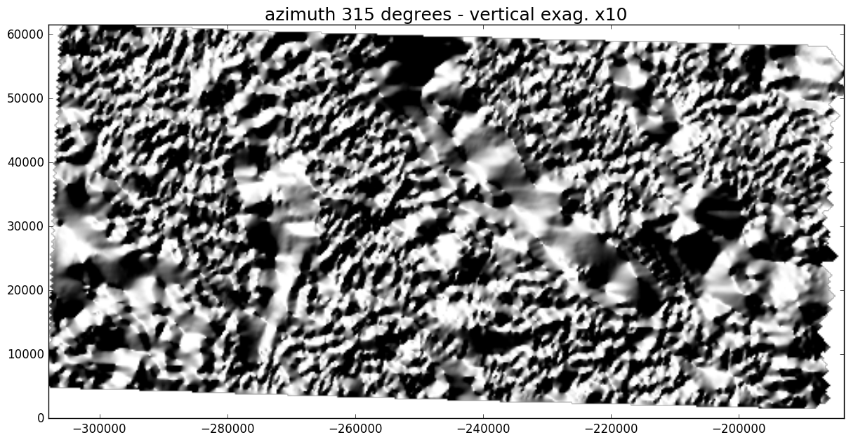
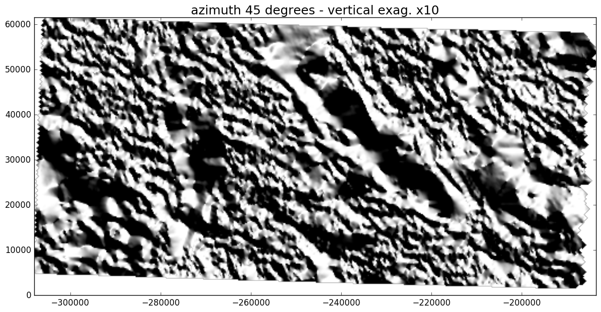
Several parameters control the shading effect when the illumination is calculated analytically. The azimuth and altitude of the light source are essential parameters. Although the sun is typically placed in the northwest corner for topographic maps, the convention is not as strict for geophysical data because changing the azimuth can be a useful way to highlight various structural directions within the data.
Here is an example with some magnetic data downloaded from the USGS website. The aeromagnetic survey covers an area of New Mexico in the US. The images below show the magnetic anomalies displayed as a shaded surface for two different light directions.
Vertical exaggeration
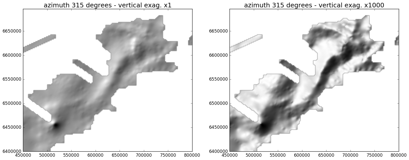
The other essential parameter for adjusting the intensity of the shading is the vertical exaggeration, commonly also called Z factor. This is a coefficient applied to vertical distances and its effect is to rescale the surface heights relative to the horizontal dimensions. While it might be preferable to keep this number close to one in the case of topographic data, it may actually be necessary to use much larger values when the range of the data is small, for example with gravity anomalies.
Here is an example with Bouguer anomalies from a recent survey in the offshore Rockall basin, west of Scotland.
Blending
The shaded image on its own is not necessarily interesting and so it is generally combined with a coloured rendering of the data. Blending the colormapped data with the grayscale image of the shaded relief can be done in various ways and three options are available in matplotlib via the LightSource class: hsv, overlay, and soft.
Here is a demonstration inspired from the matplotlib example for hillshading.
gist_earth.
The hsv mode does not look very realistic and has this ‘plastic’ feel about it. The other two modes are similar, the overlay mode showing the largest contrast.
Let’s see another example with a different colormap, ‘clra’ from Geosoft.
clra from Geosoft.
Weirdly, both the overlay and soft modes look over-saturated and too bright. The hillshading is actually barely visible. I am not sure what is causing this “reaction” of the blending to this particular colormap. I noticed a similar effect with ‘jet’, ‘seismic’ and ‘spectral’.
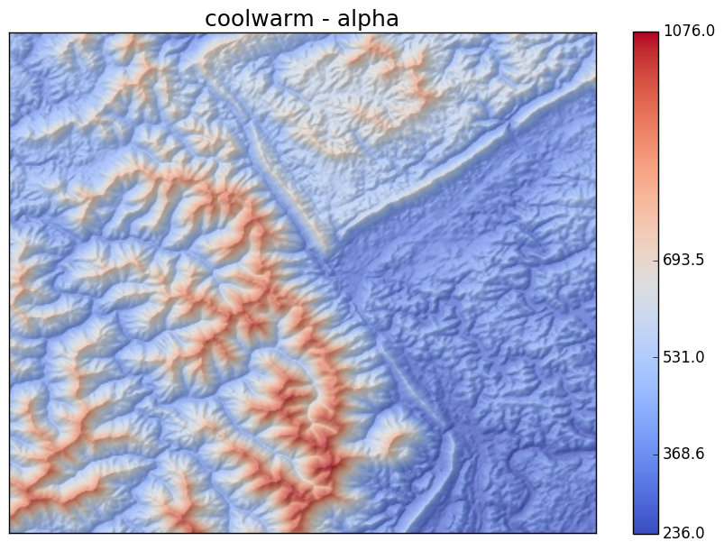
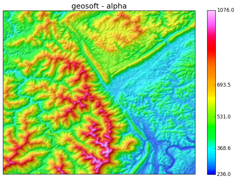
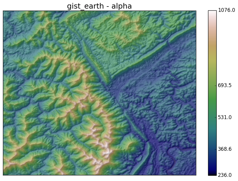
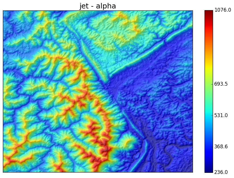
This test prompted me to work on a new blending mode: alpha blending. This is a simple linear combination of the RGB coloured image of the data with the grayscale intensity of the hillshade.
blend = alpha*rgb + (1 - alpha)*intensityThe alpha parameter controls the amount of transparency of the coloured image, 1 being completely opaque and 0 completely transparent.
The resulting effect for alpha = 0.7 and for a variety of colormaps is shown below.
Python implementation
The hillshade and new blending mode are available in a function called imshow_hs that I have written in Python. The function is part of a small package called graphics. It obviously requires matplotlib to work.
The easiest way to learn about the various options and parameters of imshow_hs is to look at the Jupyter notebook that is available on the GitHub repository.
