Histogram Equalization in Python and matplotlib
Summary
When displaying geophysical data in a map, one may find it difficult to show both the presence of extremes and the subtle variations in the background signal. Histogram equalization is there to help, as it redistributes intensities and increases the contrast. In this new implementation for Python and matplotlib, the equalization is applied to the colormap rather than the data. This allows the user to show the real distribution of intensities on the colorbar. Other ways to improve the visualisation of anomalies and their amplitude are also presented.
Introduction
Geophysical data typically contain a huge range of values. This is not surprising: geophysicists are interested in anomalies, what is different from the average, i.e. abnormal. So for example, searching for ores or metals underground, one might use a magnetometer to find the presence of magnetic sources. The objective is in this case to locate what is magnetic against what is not, i.e. to find a coherent signal against the noisy background of “normal” rocks.
But sometimes the objective is different: the geophysicist might need to highlight small changes in the background field, and in this case the large anomalies are disturbing the interpretation. This might happen when surveying for deep sources: their weak signal will be dwarfed by the large “noise” produced by shallow features.
Visualising data can be a tricky business and a lot has been written or said on the subject. It all depends on what you are trying to demonstrate and the proper use of visualisation techniques can help with your goal. But some techniques might also introduce unreal features, or deceive the reader about the true intensity of the recorded anomalies.
In this post, I am focusing on colormaps and I present histogram equalization as a way to enhance the display of geophysical data in maps. Its effect is compared to the standard linear scaling function. The implementation has been written in Python and makes use of the matplotlib library.
Scaling and the choice of color map
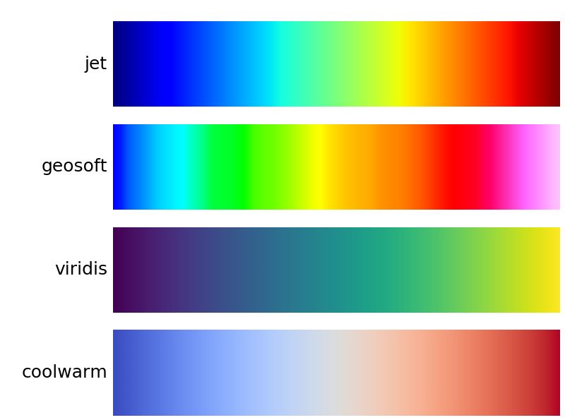
In the process of displaying gridded data with pseudo-colours, there are two important aspects: the scaling function (also called normalisation, or stretch, or classification) and the color map. A lot of authors have been concerned in the last 10 years or so about the use of the rainbow colormap (called “jet” in MATLAB and matplotlib). New, more efficient and more rational colormaps have been proposed and some of them have now become the new default choice in both MATLAB (“parula”) and matplotlib (“viridis”).
While this article focuses on the first part of the mapping process (scaling), the effect obviously depends a lot on the colormap in use. I use four colormaps here: jet, viridis, coolwarm and clra (geosoft). The first three are available in matplotlib, the fourth one is the default colormap in Geosoft Oasis Montaj, and is somehow considered as the standard choice for potential field applications (although this might change in the future as perceptually uniform colormaps become more prominent).
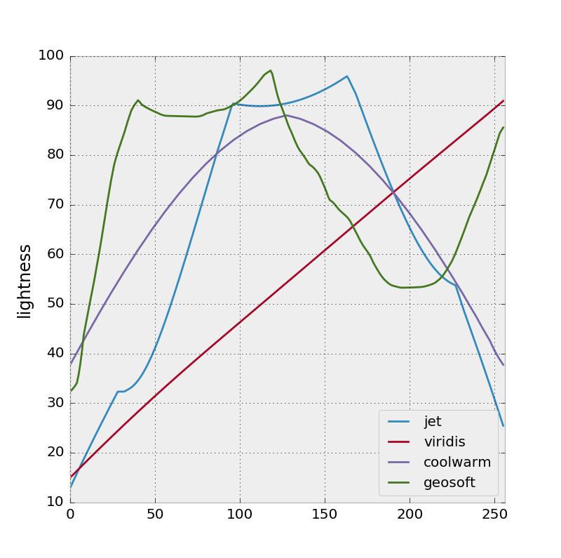
There are various ways to compare the qualities of colormaps (and again, this is not a post about colormaps) and one of the simplest is to calculate the lightness L* after conversion of the colours from the RGB to the CIELAB colorspace.
As seen on the L* profiles, the jet and clra (geosoft) colormaps show bumpy profiles with a few isoluminant portions (nearly constant lightness), which are one of the sources of criticism against this kind of rainbow-like colormaps. Thus, with such palettes, the observer would perceive variations only at colour boundaries (Borland and Talor, 2007).
In contrast, viridis and coolwarm have been designed to show simple uniform variations in lightness, which are therefore supposed to match the underlying variations of the mapped quantity, improving the perception, or interpretation of the map (Moreland, 2009).
This last point naturally leads me to the object of this post: a map is a representation of the data and it must serve the purpose of the interpreter. If the scaling function is a linear interpolation (simply matching the minimum and maximum scalar values to the colours at the extremities of the palette), then the perceptually uniform colormap has achieved its goal: the observer can read the map directly to estimate the intensity of the field (or whatever quantity is displayed). However, this might not always be the best way to convey to the reader the entire content of the data. It actually depends on the story you want to tell.
Let’s see how this works in practice with magnetic data, in an area where large variations in anomalies have been recorded. This example comes from an aeromagnetic survey acquired in New Mexico for the USGS.
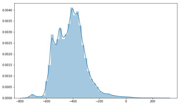
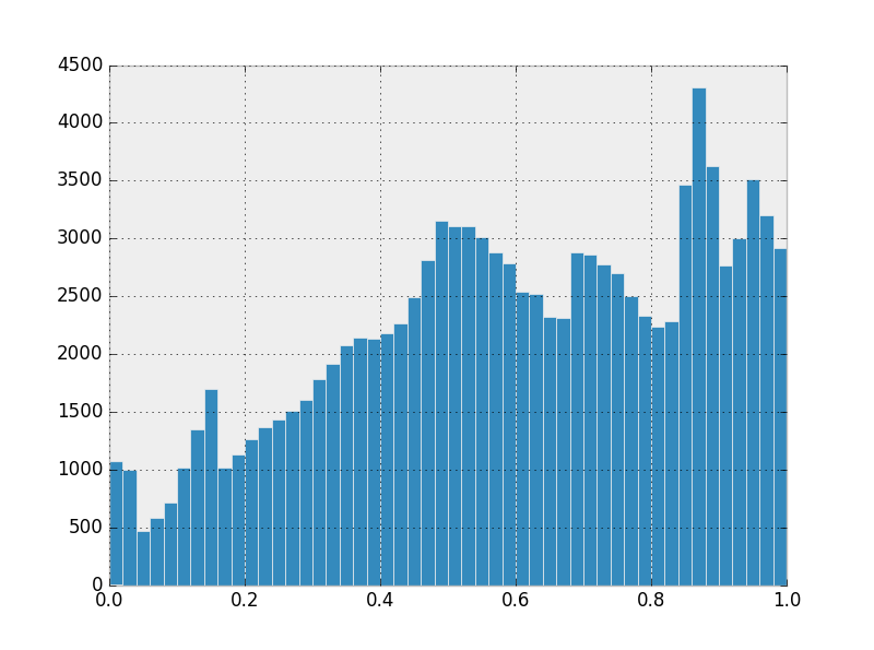
Typically for magnetic data, the minimum (-1850 nT) and the maximum (2220 nT) values are way outside the bulk of the data, which shows roughly a gaussian distribution, as shown on the histogram. This means that about 95% of the intensities are in the interval [mean - 2*sigma, mean + 2*sigma], which is about [-240,362].
Using the default options of the imshow() function of the matplotlib.pyplot module, the following map of the magnetic anomalies can be obtained.
If the objective of the map was simply to locate the largest anomalies, then it is not so bad. The two or three dark blue and red blobs in southern central region of the survey are well visible against the greenish background. However, looking for additional information in this nearly uniform background, the bright yellow and cyan patches compete to drag our attention. It is confusing.
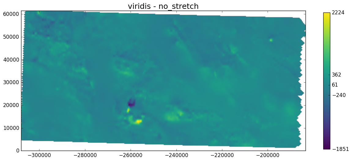
Let’s see how viridis performs:
The minima and maxima are still clearly identified and this time the rest of the map contains brighter yellow spots that are easier to differentiate against the blue-green background that is supposed to correspond to the “absence” of magnetic material (zero magnetic anomaly). That’s better.
The power of the colorbar
The maps in this post have actually been made using my own modified version of the imshow function. The idea is to have access in a single tool to a variety of functions I often use together with imshow. I have also created additional options and I am going to document them in this post and the next ones.
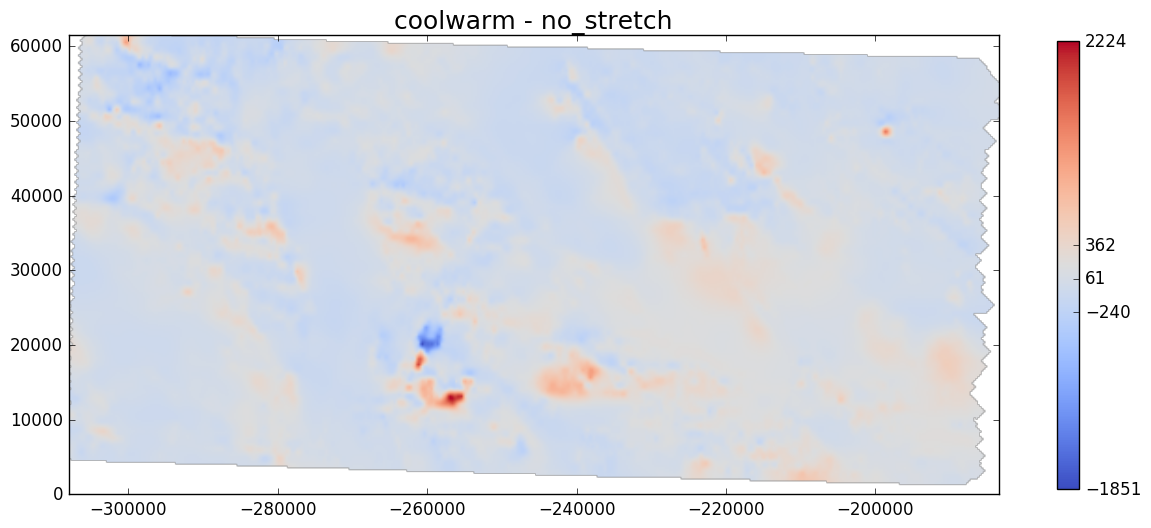
One of the simplest ways to improve the existing map is to change the labels on the colorbar. Instead of showing equally spaced numbers like on the previous plots, I think showing basic descriptive statistics on the colorbar is more informative and useful. This is how it looks:
So now the labels on the colorbar indicate, from top to bottom: max, mean+2*sigma, mean, mean-2*sigma, and min (sigma being the standard deviation). Since a map is rarely given with the histogram of the data it contains, putting statistical information on the colorbar makes it easier for the user to understand the distribution of the data.
In our magnetic case, this simply confirms the impression the reader must have when seeing this mostly blue-green image: most of the data is “compressed” in a narrow range of values.
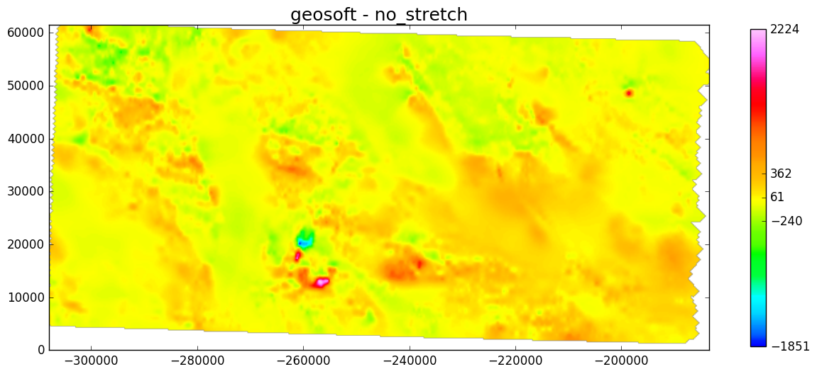
Here are two other examples with the coolwarm and geosoft clra colormaps.
The geosoft colormap is emphasising thanks to multiple colour shifts the presence of small variations around the mean of the data, something jet could not do because of the long stretch of cyan and green colours in the middle of the colormap. The addition of the bright pink at the top of the geosoft colormap also helps separating the extremes from the average. This explains why this colormap has been quite popular for mapping potential field data.
Histogram equalization
Histogram equalization (or simply equalization) has been used to increase the contrast of images for a long time. It was particularly useful to improve early satellite images that could look a bit dull through the haze of the atmosphere.
Equalization works by spreading out intensity values more evenly. The transformation aims at flattening the histogram, rebalancing the intensities over the whole span of colours (or shades of grey). Here is the equalized histogram of the magnetic data we have seen earlier.
There are two ways to implement histogram equalization, either as an image change (like in scikit-image), or as a colormap change. I have chosen the second option as it has two advantages: the data remain untouched and the new colorbar clearly shows the distortion applied to the colormap.
The effect of histogram equalization depends on the input data so the new colormap is unique and cannot be re-used for a different data set.
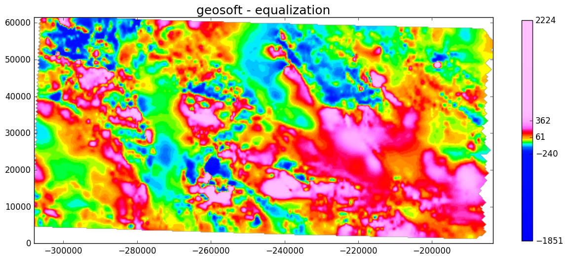
Here is an example with the geosoft clra colormap.
The result might look dramatic but that is intended. Minute variations in the data are now revealed and some sharp lineaments are immediately visible. This new map makes the structural interpretation of the magnetic data easier because for this purpose I am more interested in spatial correlations and the shape of features than in their intensity. I also see all the tiny anomalies, as if the instrument was suddenly much more sensitive.
The application and effects of such severe contrast enhancement techniques should not be concealed or minimized. The new colorbar makes it obvious that large portions of the data are displayed with pretty much the same colour (pink or blue). The idea of histogram equalization is not to pretend that the data is much better than it is in reality. The change is only misleading if the information about it is not provided clearly and honestly, in the legend or in the caption.
Contours
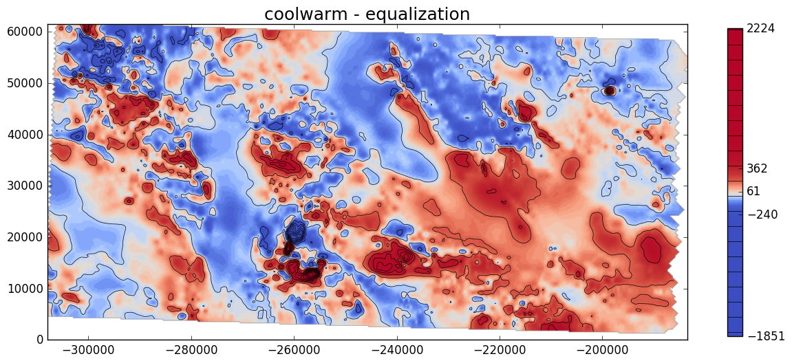
Another way to remind the reader of the map that some of the anomalies are much larger than the others is to add contours. Contours are drawn at regular intervals so one obtains a map that combines the best of both worlds: the enhanced contrast of the non-linear colormap and the sense of scale offered by the evenly-spaced contour lines.
With matplotlib, it is even possible to also have the contour lines on the colorbar! Here is an example with the coolwarm colormap.
Python implementation
I have implemented histogram equalization in a Python module called graphics. It contains two modules:
colors: this contains the definition of new colormaps for matplotlib (essentially clra and clrb from Geosoft Oasis Montaj).graphics: a collection of functions for manipulating and displaying grid data.
The main function in graphics is imshow_hs, which is my modified version of pyplot.imshow. It offers a lot of parameters, some of them are simply imported from other pyplot functions (like colorbar and contours), and some of them are new (equalization and improved hillshading). See the documentation in the code on GitHub for more information. I have also prepared a Jupyter notebook that goes through some of the main options.
The hillshading option will be the subject of another post.
Conclusion
I have added histogram equalization to a modified version of matplotlib’s imshow. This is a quick and easy way to boost the contrast of images and it helps visualizing the full content of geophysical data.
Manipulating data in this way might sound suspicious since the current evolution of scientific visualization software is to promote the unbiased, neutral display of data with the use of perceptually uniform colormaps. However, pseudocoloring is not the only way to communicate about the amplitudes and variations of data: descriptive statistics, hillshading, contours and 2D profiles are also quite efficient, if not better.
There are lots of methods to improve the “look” of geophysical data and geophysicists are good at inventing all sorts of them: rescaling, clipping, filtering or applying derivatives can all contribute to an enhanced picture that is easier to interpret.
The important thing is to be honest and clear about the tricks that have been applied to create that pretty picture. This is why colorbars and figure captions are important!
Links
Data
USGS magnetic data: South Silver City (4017) Magnetic Anomaly Map
Wikipedia
https://en.wikipedia.org/wiki/Histogram_equalization
TED Talks
http://www.ted.com/talks/david_mccandless_the_beauty_of_data_visualization http://www.ted.com/talks/hans_rosling_shows_the_best_stats_you_ve_ever_seen
Blogs and articles
Matplotlib doc: Choosing Colormaps
MyCarta: The rainbow is dead…long live the rainbow!
Kenneth Moreland: Diverging Color Maps for Scientific Visualization
Borland, David, and Russell M. Taylor Ii. “Rainbow Color Map (Still) Considered Harmful.” IEEE Computer Graphics and Applications 27.2 (2007): 14-17. DOI: 10.1109/MCG.2007.323435
